What makes a Good Coworking Space Website?
GuidesWhy do you need a good website?
A good website will increase your revenue.
The majority of members will actively research a coworking space online before making a decision about whether to get in touch. Your website represents an opportunity to make a great first impression and reassure customers that you can meet their requirements.
Having a well-designed website will differentiate you from your competitors. The best coworking websites build a brand; they convey personality, the atmosphere of the space and member experience. By shaping your online brand you are more able to attract the exact type of customers you are searching for.
Finally, a great website can save you time, generate leads and increase lead conversion. By providing relevant information, supplemented with compelling calls-to-action, you can increase the amount of high-quality inbound leads you receive. These customers will typically be ready to make a positive decision after exploring your amazing website.
What makes a good website? (with examples)
1) It’s easy for customers to find the information they need
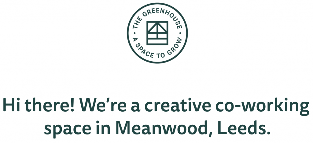
Example – The Greenhouse (https://www.the-greenhouse.org.uk)
The Greenhouse, based in Leeds, is a wonderfully leafy space. Their website is comprised of just one page, but in that one page you learn everything you need to know.
When we open the website, we are greeted by an immediate statement of their purpose accompanied by a bright and friendly image. Just below, we find a concise description of the space which paints a picture of the atmosphere and the crowd who gather at The Greenhouse.
The following section is dedicated to explaining the types of membership they offer, with simple pricing plans and a clear description of what is included. This is supported by a list of upcoming events and workshops. This shows you that The Greenhouse is an active community and makes it known that the space can also be hired for events.
Finally, the website gives you options for further insight through social media links, email contact details and physical location.
Key Lesson from The Greenhouse
Keep things simple. Customers appreciate the clarity.
2) There is a focus on people and solutions
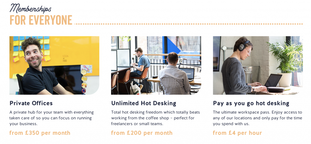
Example – Work.Life (https://work.life)
Work.Life is a prolific workspace operator, with 9 locations in the UK. Looking at their website, you can see why they are successful. They make it crystal clear that they care about you and that they can accommodate you.
The very first thing you see is a video showing a lively workspace full of people being productive in a well-designed office. You are immediately made to feel like you could work there.
Scroll down the homepage and you will come across multiple examples of the focus on people and solutions, e.g.
- Teams are happier at Work.Life
- Memberships for everyone
- Need temporary office space?
- Perks for your business / Perks for your team
This strategy of engaging site visitors in a direct, conversational tone is a great way of encouraging them to explore your website further, or even get in touch immediately.
Key Lesson from Work.Life.
Remember that customers do not make decisions based on a list of features, they make decisions because they see a solution to their problem.
3) There is a clear goal for visitors
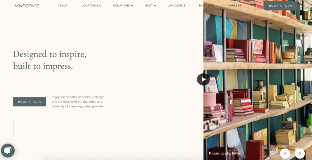
Example – Mindspace (https://www.mindspace.me)
Mindspace is a global coworking operator with 23 different locations across 7 countries. What’s the first thing you see when you visit their website?
‘Book a Tour’… Twice!
They don’t invite you to explore their 23 locations. They know that 99% of website visitors will only be interested in the location local to them. Instead, they encourage you to start a conversation by booking a tour.
Once you’ve initiated a conversation, you’ve become more than an anonymous site visitor, you’re now a potential customer.
This strategy still applies to single-site coworking operators. Use clear and compelling calls-to-action to guide your customers to the desired goal. Customers enjoy a journey, they do not enjoy an odyssey.
Key Lesson from Mindspace
Guide customers to the outcome that works best for you.
4) It looks good and has personality
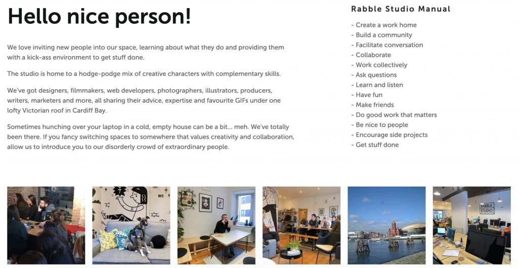
Example – Rabble Studio (https://rabble.studio/community)
Rabble Studio, based in Cardiff, has built an awesome creative community. This is a source of pride and they have built their website around this fact. Every page invites you to join this fun and exclusive crowd.
Aesthetically, the website design is really fresh with easy-to-read font, a simple colour palette and a neat layout. Every chunk of text is packed with personality and accompanied by bright, welcoming images.
Notice also that on every page you visit you are reminded that you are on Rabble Studio’s website. Consistent branding helps to plant a seed with customers, so when it comes to decision-making time, they will remember Rabble Studio.
Btw, they’ve just launched a digital membership, in case you want to join this ace community.
Key Lesson from Rabble Studio
Don’t be afraid to show your personality. Coworking is a people business.
5) It’s SEO friendly
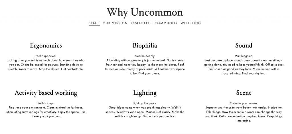
Example – https://uncommon.co.uk
With four unique spaces, Uncommon is one of the most successful coworking operators in London. It’s easy to see why when you begin searching Google for coworking spaces in London. Uncommon consistently ranks highly for a wide variety of searches and therefore attracts a lot of inbound leads.
How do they do it?
- By building a reputation for wellbeing, Uncommon has secured a place on many third party lists, such as, ‘top coworking spaces in London’. These backlinks (think of them as votes) tell Google that Uncommon is a great space, so it recommends the space to searchers.
- The site structure and navigation are super streamlined. There are no wasted words or pointless areas of the website and it’s incredibly simple to find the information you seek.
- They frequently produce shareable blog posts which increase traffic, encourage online interaction and convince Google that they are a reliable source of content.
To be honest, Uncommon meets every point on this list and they are an excellent source of inspiration for your website.
Key Lesson from Uncommon
Find a niche, make it your USP and build upon it.
Bonus: If you would like to start making your own website SEO friendly, I recommend you check out our guide with lots of actionable tips.
So there you have it.
Designing a high-quality website can be time-consuming but it is absolutely worth the investment.
The member experience doesn’t stop at your website though. You should continue to provide a first-class digital experience for your members by investing in coworking space management software. More specifically, Coherent
Get in touch with us at hello@coherent.work to learn more.
Alternatively, have a browse of our website or check out the five reasons you need coworking software.